
9.5 KiB
Tabler 1.6 is out. It brings eight new components, a datepicker that doesn't depend on Litepicker any more, a neutral gray scale, colors defined in oklch() and a focus ring that's finally an outline. The CSS also got smaller: about 110 kB came off tabler.min.css. On top of that there are more than a hundred smaller changes across the framework, the demo pages and the docs.
Datepicker
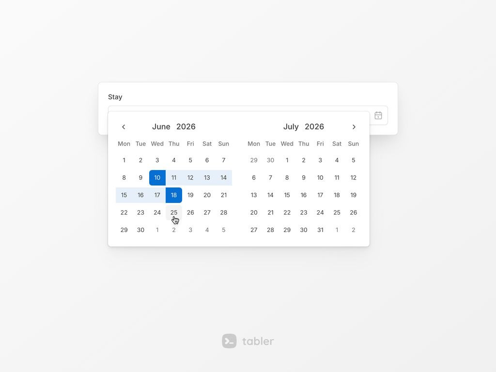
A calendar popup for a text input or a button, or an inline calendar on the page. It handles a single date, several dates and a range. It's built on Vanilla Calendar Pro, so Litepicker is deprecated, and the docs have a section on moving over from it.
Sparkline
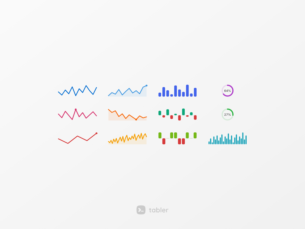
Tiny line, bar and circle charts drawn inline with text, for a trend in a table cell or next to a number. The chart is an SVG rendered from data-bs-values, so no chart library is needed. It takes its color from text utilities and its size from classes.
Legend
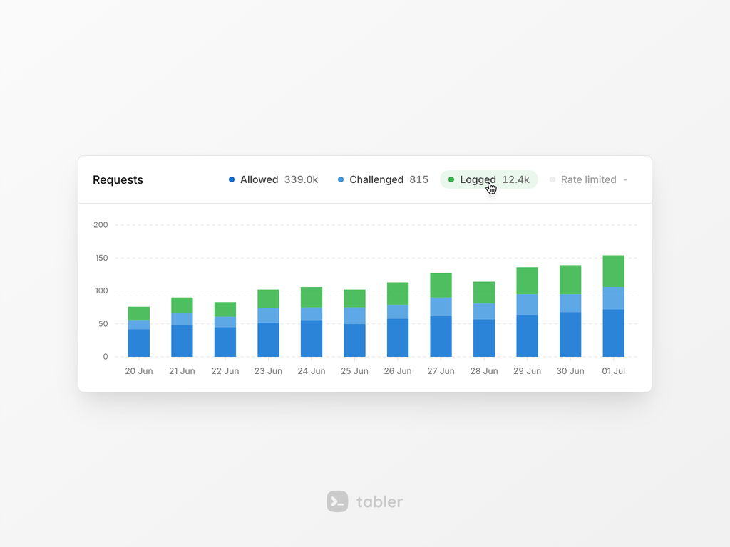
A colored marker, a label and an optional value for the series of a chart or a progress bar. Group items with .legend-list, and turn on the interactive mode to toggle a series on click. The large variant .legend-lg shows a big value with a unit.
Signal
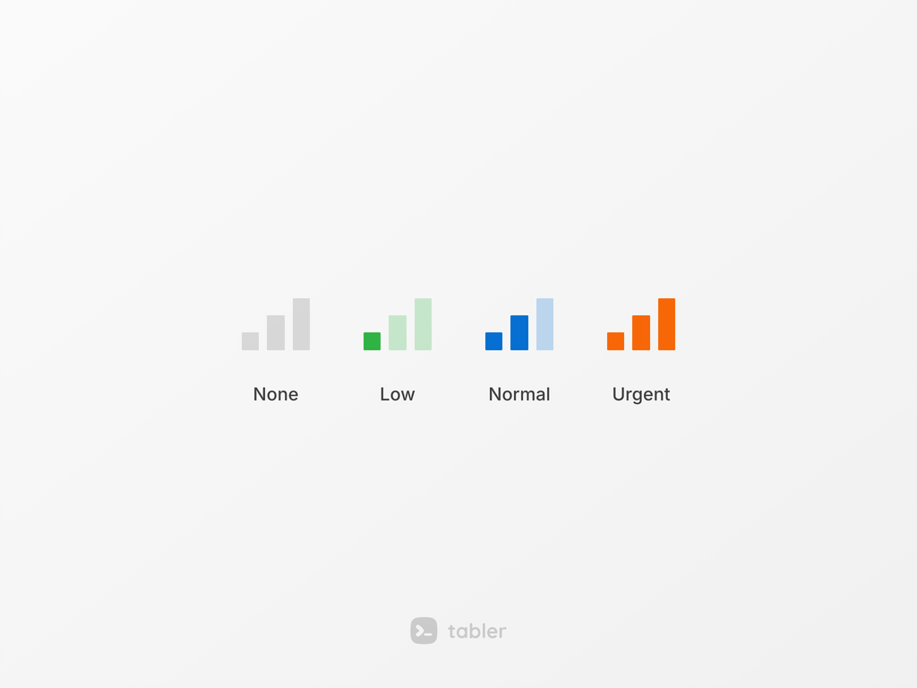
A small row of stepped bars that shows a level, such as priority, strength or coverage. It sits next to a label, and the number of bars, the color and the size are all adjustable.
Password strength
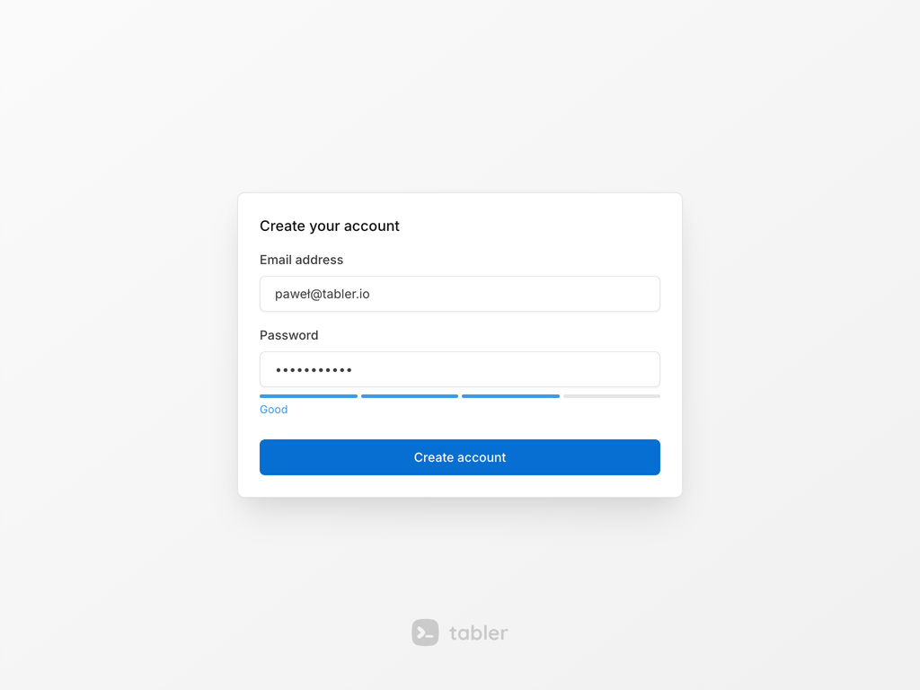
A segmented meter that rates the password as the user types, so a weak password is visible before the form is sent. The scoring and the labels are configurable, and every change fires change.bs.strength.
OTP input
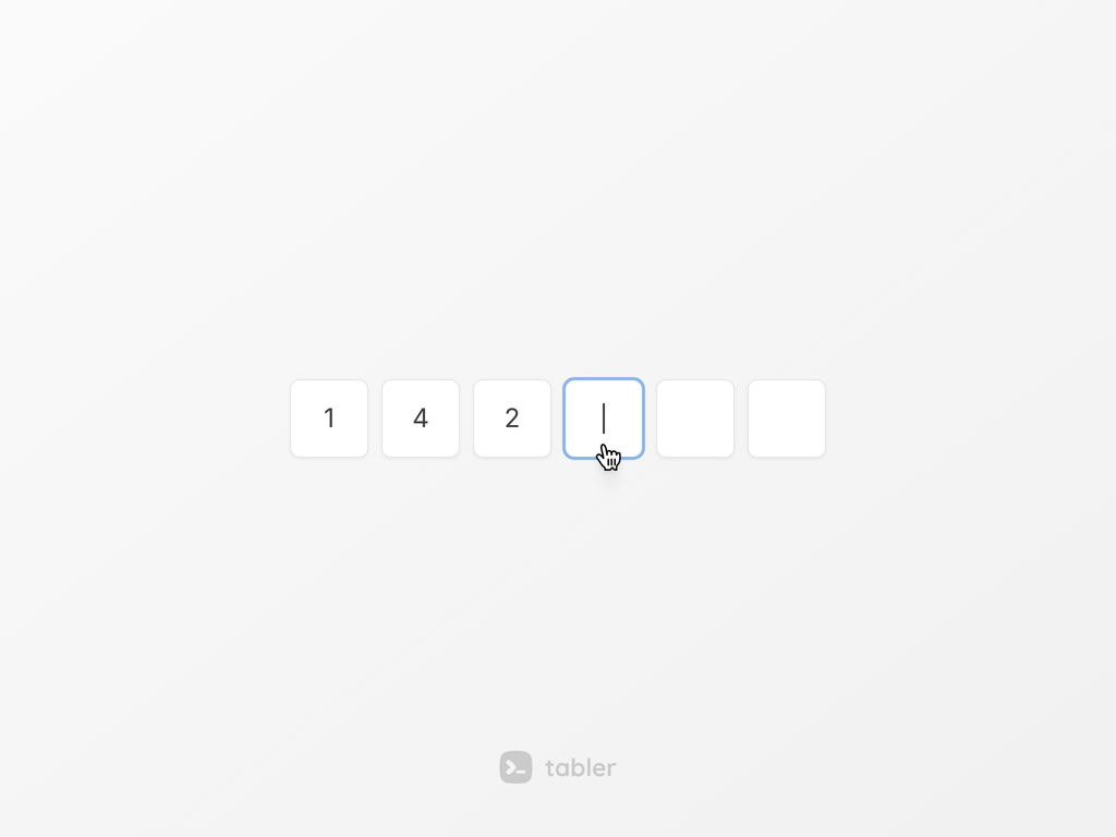
A one-time code field shown as separate character slots. It's still one real input underneath, so autofill, password managers, SMS codes and screen readers work. Slots can be grouped and masked, and there are validation states.
Clipboard
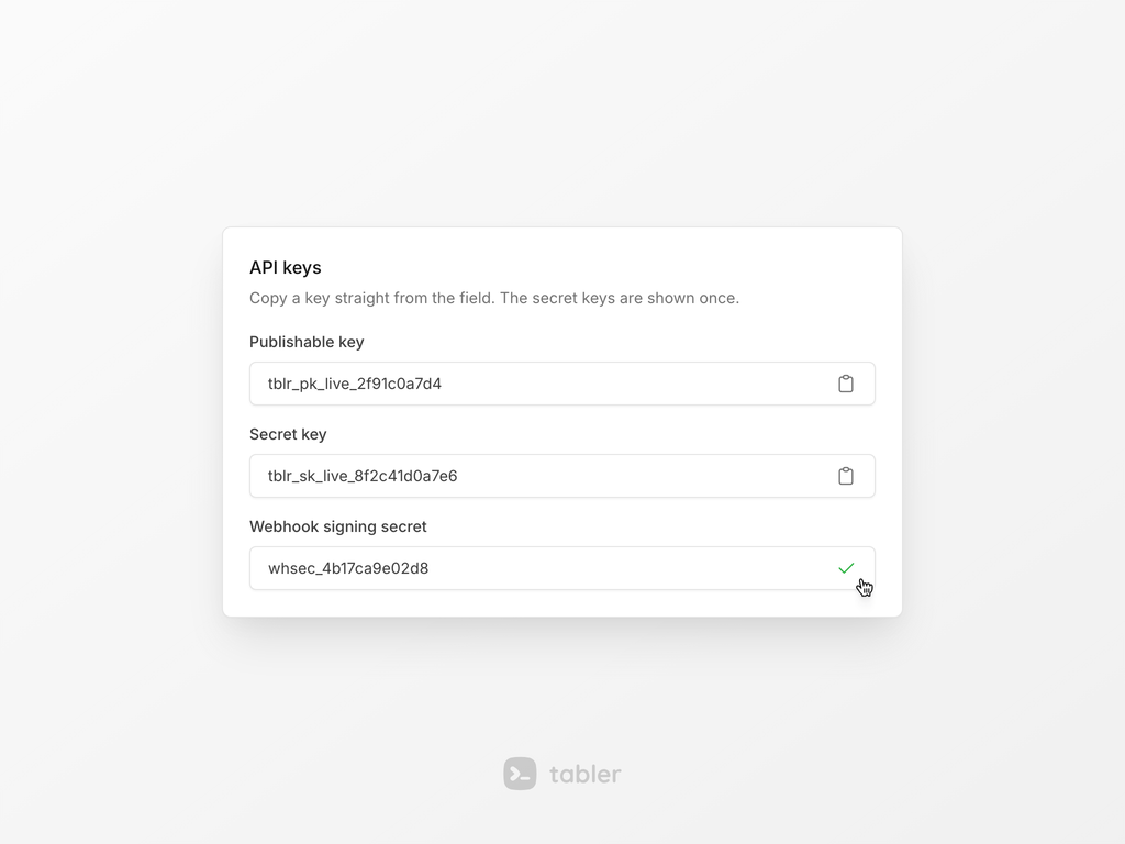
A copy button for the text of a field, an element or a literal string, with a short copied state. It's built on the browser clipboard API and fires events, so dist/libs/clipboard is deprecated.
Confetti

A short shower of colored pieces over the page, for a finished setup, a first order or a signup. Put data-bs-toggle="confetti" on a button or call it from JavaScript, and set the amount, length, speed and colors with data attributes.
Plugins are components now
Autosize, CountUp, InputMask, Sortable and SwitchIcon are real components with instances, methods and events. Autosize and CountUp are written from scratch and don't need the dist/libs scripts any more, so those are deprecated. CountUp respects prefers-reduced-motion.
Switch icon got a switch-icon-loading state. Pass a promise to event.wait() in the toggle.bs.switch-icon event and the button shows a spinner until it settles.
Sortable got drag styles for the ghost, the chosen and the dragged item, and the demo shows a drag handle, table rows, a kanban board, clone, multi-drag and swap.
tabler.js also no longer stops on page load when one element has an invalid data-* config. The error is logged and every other component is still created.
Neutral gray and oklch colors
The default gray scale is neutral now. In 1.5 it had a slight blue tint, so backgrounds, borders and muted text look a little different. To keep the 1.5 look, load tabler-themes.css and set data-bs-theme-base="gray" on <html>.
The palette is defined in oklch(), and tints, shades and hover states are mixed with color-mix(in oklab) instead of rgba(). Mixed colors are a touch cleaner, mostly noticeable in the lighter backgrounds. The --tblr-*-rgb variables are deprecated and stay until 2.0.
The focus indicator is a solid 2px outline instead of a box-shadow halo, stronger in dark mode. You can tune it per component with --tblr-focus-ring-width and --tblr-focus-ring-color.
Floating navbar and offcanvas
.navbar-floating detaches the navbar and the sidebar from the edge of the screen with a 0.5rem gap, and .offcanvas-floating does the same for an offcanvas. The theme settings data-bs-navbar-style="floating" and data-bs-offcanvas-style="floating" on <html> switch the whole page.
A native <dialog> opened with showModal() gets the same backdrop as a modal, and .modal-blur on it blurs the page behind. Scrolling to the end of a modal, an offcanvas or a scrollable dropdown no longer scrolls the page behind it.
Smaller CSS
tabler.min.css lost about 110 kB. The button, list group, bg-pattern-* and color utility styles are generated once instead of per variant, and the vertical navbar is generated once instead of per breakpoint. The flag, payment and social SVGs in dist/img are minified, and only the images the CSS uses are copied.
If you ship your own build, $enable-deprecated: false leaves the deprecated aliases and the --tblr-*-rgb variables out of the CSS entirely.
Demo and docs
The demo has a new billing page, a system status panel with 60-day uptime bars, gauge cards on the widgets page and a reworked charts page with sections and legends. The hardcoded Google Maps and Mapbox keys are gone; the map demos read them from the environment.
Component docs pages got a CSS variables section generated from the source, so it can't go stale. Markdown tables and the class reference table sit in a bordered, scrollable box. The CDN snippets carry integrity and crossorigin attributes. There's a Sortable page, an agent skill under /.well-known/agent-skills/, and the upgrade guides moved to /ui/getting-started/upgrade/ with one page per release.
Upgrading
Nothing in 1.6 requires a change to your markup. Two things can trip a build:
- 69 Sass variables that were plain colors are
color-mix()strings now, so they follow--tblr-*overrides in the browser. That's the*-bg-subtle,*-text-emphasisand*-border-subtlefamilies,$body-secondary-color,$input-focus-border-colorand a few navbar, dropdown and switch colors. Overriding them still works, but a Sass color function such asdarken()orrgba()on their default value fails. Build from the base color instead:shade-color(tint-color($primary, 80%), 5%). - The component port is compiled with strict TypeScript and every config is typed. A TypeScript project that passes a loosely typed options object to a component may get new type errors. Nothing changes at runtime.
A few things are deprecated and keep working:
.form-hintis.form-textnow, matching Bootstrap. The old class is an alias.- An empty
.legendstill renders as a dot, but.legend-dotis the class for it. - The
$*-focus-box-shadowvariables,theme-color-lighter(),url-svg(),varify()and a few other Sass helpers warn when used. - The
tabler.tablerJS namespace withgetColor()andhexToRgba()is deprecated. Read the variable yourself.
Every change, with a before and after example for each one, is in the Upgrade to 1.6 guide.